

National Soccer
The Guatemala selection logo has been suffering a series of variants throughout history, where the quetzal has always been the referent of the image.
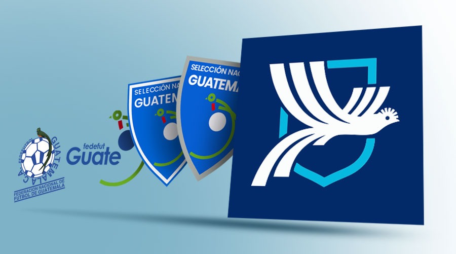
Evolution of the Logo of the Guatemala of Soccer. (Free press art: Marcos Gálvez)
On Thursday, the president of the Football Federation, Gerardo Paiz, announced at a press conference the new design, which has generated a more negative than positive comment series the new shield.
It is a logo where although the quetzal prevails, He completely moves away from the concept of the last 20 yearswhich has not been liked by the followers of the national team.
It should be noted that in the last 35 years, The Guatemala selection logo has suffered four variants with the one presented last Thursday by Gerardo Paiz, where if the process was compared, a line had been maintained, which was lost with the new design.
In 1990 to 2005, The logo was a soccer ball where the quetzal perched on the topwith the name of the Guatemala Football Federation at the bottom.
Then he was redesigned in 2006, where he kept the one so much more graphic, that poses on a small circle that simulated a ball. That predominated until 2010.
In 2011 year he had a refreshment, where he remained from Quetzal’s design, But now within a blue back shield and with the name of the National Team of Guatemala at the top.
In 2018, A gray contour to the shield was added and that remained until 2025 that the new national team logo was announced and that it is also the image of the Football Federation in its different social networks.
The new logo design is a quetzal in a background in a celestial contour. The design was prepared by a Costa Rican company and had a cost of US $ 25,000, Which was paid with personal resources from Gerardo Paiz, as reported by the same manager at a press conference.
